#4127: Paz Vizsla

PAZ VIZSLA

STAR WARS: EPIC FORCE (HASBRO)

“A descendant of the esteemed house Vizsla, brawny warrior Paz Vizsla is protected by the strongest Beskar armor.”

Would you believe I’ve finished up all my Saga reviews?  Well, I guess I haven’t *really*, but I’ve finished all the reviews of figures that are ready to go, since all the ones I have left are pretty woefully incomplete.  I’m past the days of incomplete figure reviews…mostly.  Anyway, I’m actually jumping a fair bit further ahead for today’s review, to something “modern” era, though still a couple of years old at this point.  I don’t get much into the Mandalorian-based stuff anymore, but I’m doing at least this one jump back with a look at this Paz Vizsla figure that’s, you know, actually named Paz Vizsla, rather than just “Heavy Infantry Mandalorian.”

THE FIGURE ITSELF

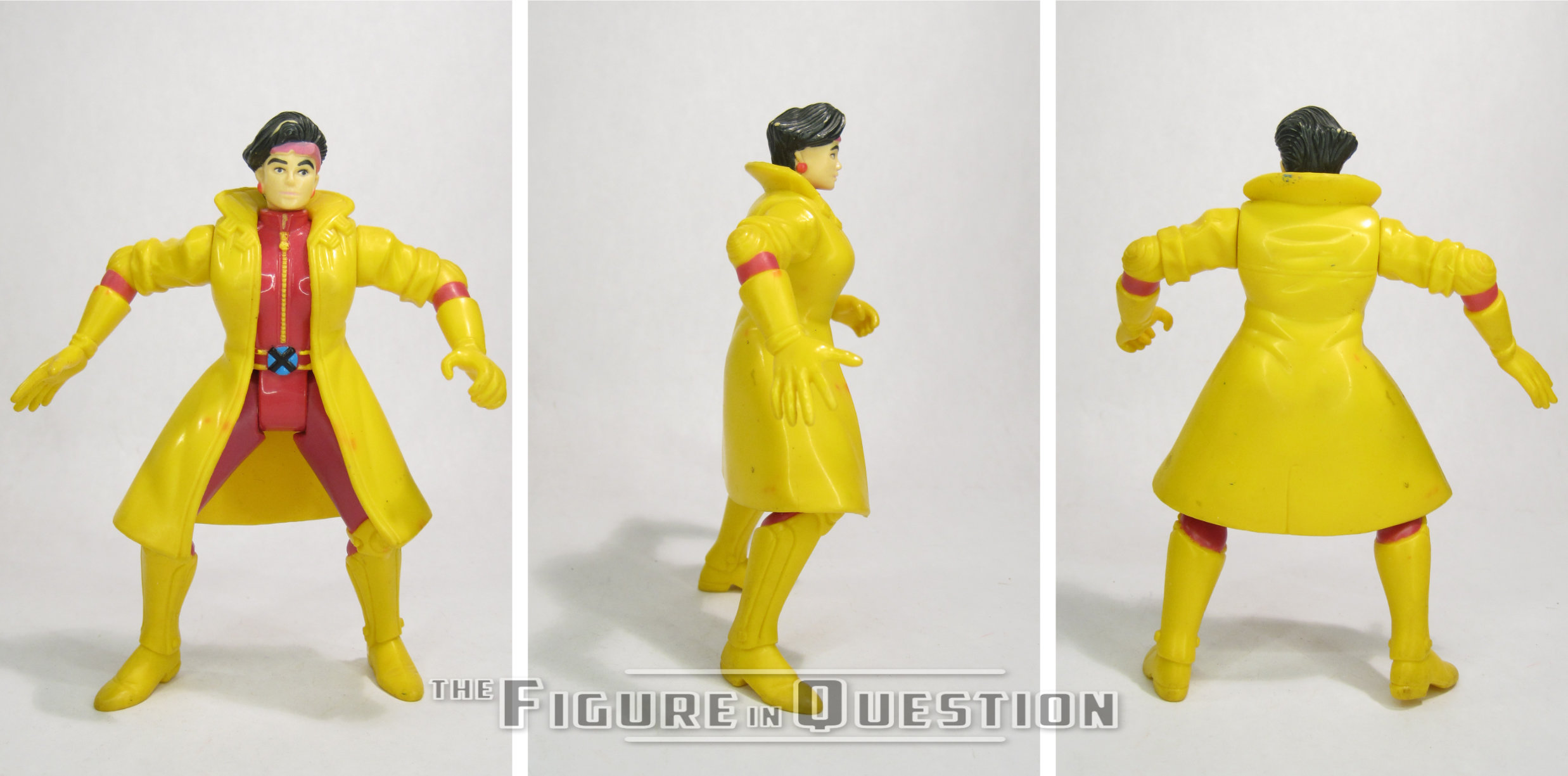
Paz Vizsla was part of the debut assortment of Hasbro’s Star Wars: Epic Force line, back in 2024.  He was one of two deluxe figures in the set, the other being Sabine.  Paz has pretty much always been relegated to the deluxe sizing, so it makes sense that it happened again here.  The same core figure, with a different selection of accessories, was also available in the “Unite the Clans” three-pack at the end of the year.  The figure stands 4 inches tall and he has 5 points of articulation.  The Epic lines are all technically 4-inch lines, rather than 3 3/4-inch, and it was especially notable on the earlier Star Wars stuff.  Thankfully, in the case of a character like Paz, they stuck to that strict 4-inch mark, which means that he scales okay with earlier figures, since Paz should be a little taller than the others.  His sculpt is unique to him, and it’s based on his design from the show.  The level of detail here is definitely not as in depth as, say, a Vintage Collection figure, but it’s a little more than a Retro Collection figure, making it kind of feel a bit like a mid-run Power of the Force figure.  Gee, I wonder who around these parts might like such an aesthetic? Honestly, it works well.  It gets all the important details down, with a decent degree of sharpness, but it still lets them do more of a basic feel overall.  The paint work here leans heavily into the basic side.  The broad colors are present, but there’s a lot of spots where things are just left unpainted.  This is where the figure feels more like a Retro Collection or even proper Kenner figure over, say, Power of the Force, because after the ‘90s, it was very rare to just get straight up unpainted details.  The torso is definitely the most stripped down, with a lot of just unpainted dark blue.  Other sections get more variation, though, and the actual application is clean.  Paz is packed with his jetpack (which is definitely a fair bit oversized), his large gun (which has been converted into a missile launcher and is *comedically* oversized), a missile for said large gun, and a removable flame-thrower effect that clips onto either of his forearms (though it has a gauntlet attached which is quite clearly meant to match the left side).  They cover all of his standard extras, and there’s enough more there relative to the standard releases that it feels like “deluxe” was justified.
THE ME HALF OF THE EQUATION

When Epic Force launched, I liked the idea, especially with the similarities to Power of the Force, and the fact that I’d really been bummed out by the ending of the basic 5-POA line after Resistance, but I’d also kind of moved on and was focusing on scaling back on my Star Wars collecting in general.  That said, one of the collections I more or less kept intact was my modern era Retro Collection stuff, and Paz was notably absent from that set-up, so this figure offered a decent little “close enough” set-up.  I wouldn’t say it was enough to make me go out hunting, but when a loose one came into work, I really had no good excuse not to, and so he got added to my collection.  And, you know, sat in a box for two years waiting to be reviewed.  Look, I got to him, didn’t I?  It’s interesting to look back at this figure now, given how quickly the Epic line evolved into something totally different than what it was here.  He’s a weird sort of middle-ground figure, and while I’m happy to have a Paz that fits with my Retro figures, it’s not hard to see why this incarnation of the line really struggled to find its footing.  He’s a good figure and a good toy, but just feels so very much like he’s from an entire different era than the one that spawned him, which is odd for a figure that’s not intentionally a throw-back. 

#4126: Advanced Stealth B.A.T.

ADVANCED STEALTH BAT

G.I. JOE AND THE TRANSFORMERS (COLLECTOR’S CLUB)

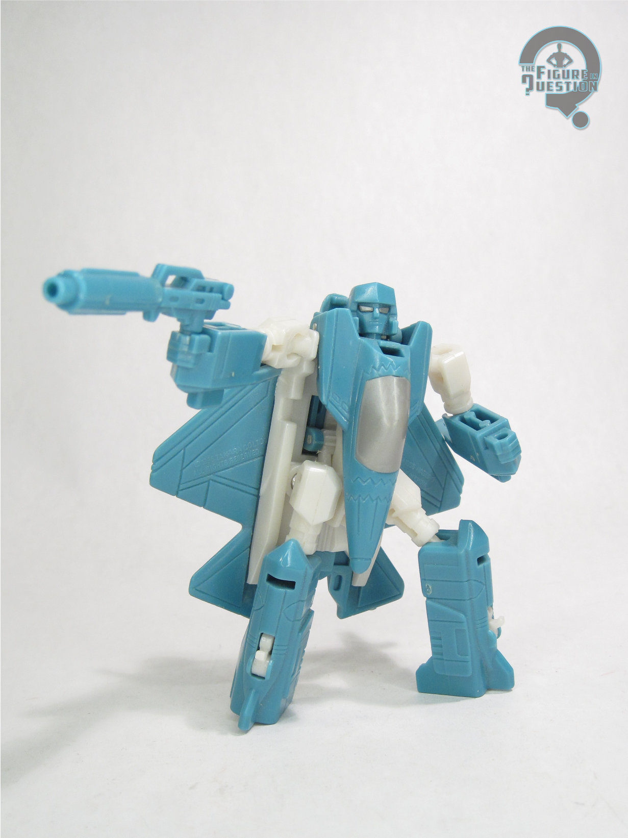
“OLD SNAKE’s first attempt to harness a strength similar to the AUTOBOTS, that he once tried to capture, resulted in varied results. The hulking robot of Old Snake’s creation truly did possess brute force as well as great intelligence, however, the interference from former GENERAL CLAYTON “HAWK” ABERNATHY and the EARTH DEFENSE COMMAND caused the loss of any semblance of control over SERPENT O.R. Not willing to commit the same error again, Old Snake decided to forgo intellect in his next endeavor. Mimicking the programming from COBRA’s prolific but now-outdated Battle Android Troopers, Old Snake upgraded the COBRA B.A.T. with added size as well as the ability to disguise themselves as Unmanned Aerial Vehicles (UAVs). Although not quite the height of the Autobots, the lithe and agile STEALTH B.A.T. can maneuver in ways that most of the robots from CYBERTRON cannot even imagine. To further aid in espionage as well as assault operations, each Stealth B.A.T. also features a detachable bat-like NIGHTSHRIEK remote unit that can access small spaces and create havoc through sabotage and data breaches.
A Stealth B.A.T. has the potential to become the truly perfect soldier, with the sound of their mighty steel boots causing fear and panic wherever they march. With each attack that they commit, COBRA comes closer to regaining the greatness and glory it once possessed!”

As two Hasbro-owned properties depicting a pair of warring factions embroiled in a heavily sci-fi-based war, G.I. Joe and Transformers are no strangers to crossovers.  While the cartoons in the ‘80s merely suggested a crossover (with the character “Old Snake” clearly being an older Cobra Commander after his organization has fallen away), the comics have had a number of direct crossovers, and, eventually, so did the toys.  Hasbro had some offerings of their own, usually pairing off G.I. Joe figures with non-transforming vehicles done up to match the colors of proper Transformers, and that was further built-upon through some crossover projects between the two franchises’ respective Collector’s Clubs.  In 2015, the Clubs collaborated on a set sort of based on “Only Human,” the episode of Transformers that featured Old Snake, with a pack that featured Snake himself, as well as two upgraded versions of the Cobra B.A.T., now featuring a transformation gimmick.  Today, I’m taking a look at one of those B.A.T.s!

THE FIGURE ITSELF

The Advanced Stealth B.A.T. was released alongside Old Snake and a duplicate B.A.T. as a three-pack in the G.I. Joe and the Transformers line, a 2015 joint-exclusive between the G.I. Joe and Transformers Collector’s clubs.  The set was the second such exclusive.  While Old Snake was a more direct cartoon-adaptation, the B.A.T. is a unique design, albeit one that’s a fairly sensible one within the context of the story they’re setting up in the bio.  The figure stands about 5 1/2 inches tall and has 23 workable points of articulation.  All of the Collector’s Club figures were rather heavy on re-used parts, so as to keep costs down.  In the B.A.T.’s case, they’ve opted to use the 2012 Transformers Prime Soundwave mold.  I’m a big fan of this mold, and I think it’s a really well implemented translation of the cartoon design, which is itself a pretty great design.  It poses well, and its transformation, though a little bit fiddly, works well, and holds together nicely.  It’s also a good mold in terms of capturing the general B.A.T. feel, since the face plate kind of follows the same general layout, and the more angular body shaping goes well with the usual B.A.T. depictions.  The only real downside is those fins on the back, which were prone to warping on the original use of the mold, and are even more warped on this release.  The color scheme is classic B.A.T, leaning more heavily into the cartoon look, especially with the red visor.  Like the original version of the mold, this figure transforms into an aerial attack drone, which feels like a good fit for the B.A.T.  I love that the red visor remains present in the alt-mode as well.  The Stealth B.A.T. includes “Nightshriek,” a recolored version of Prime Laserbeak, who matches the B.A.T.’s color scheme, and even adds a little bit of turquoise, simulating the chest panel of the original B.A.T. when placed on this figures torso for storage. 

THE ME HALF OF THE EQUATION

Long before I had anything to do with Transformers, I was a pretty involved G.I. Joe fan, and I have always particularly liked the B.A.T.s and their various incarnations.  When I finally *did* dip my toes into Transformers, the first one I picked up for myself, just of my own volition was the Beast Hunters variant of Prime Soundwave, because I’ve always liked Soundwave, and I just liked the look of the mold.  It’s become perhaps my favorite mold of one of my favorite Transformers, so when I found out it was used for a B.A.T. in the crossover, I was certainly intrigued.  Of course, it’s not like the set’s super plentiful and easy to find, and it’s enough of a slog to get one that even Max, my go-to Transformers expert guy, didn’t have one.  When this one came into work, all by himself, with no Old Snake, and no duplicate B.A.T., I wanted it, but also was completely content to let Max have it, since he was the Transformers guy.  That’s what he does.  That’s his thing!  And he was gonna take it, but, at the last second, he handed it over to me, because he felt like it would mean more to me, what with it being a G.I. Joe crossover figure built on a Soundwave mold and all.  Because he’s nice like that.  That’s also what he does.  That’s also his thing!  I do very much appreciate Max’s sacrifice on this one, because this is honestly a favorite of mine, and has remained on a shelf next to my desk, frequently serving as the figure I idly fiddle with while working, for most of the four years since I got him.

#4125: Robin

ROBIN

SUPER POWERS (McFARLANE)

“Robin was the sidekick of Batman and a member of the Justice Society Infinity”

In 1961, Flash #123, a story titled “Flash of Two Worlds,” reintroduced the original Flash, Jay Garrick, by showing his exploits as having taken place on a parallel Earth to that of Barry Allen, the then current Flash.  The story’s success led to follow-ups, reviving other Golden Age DC heroes, and placing them on this newly created “Earth 2.”  Since Earth 2 had allowed the characters to age more or less in real time from where they’d been left off in the ‘40s, when the “original” Dick Grayson reappeared six years later in 1967, he wasn’t a teen sidekick anymore, but rather an adult member of the Justice Society.  But, where his Earth 1 counterpart would take up the monicker “Nightwing,” Earth 2 Dick maintained the “Robin” name.  While the Earth 1 Dick gets most of the toy coverage, Earth 2’s version gets a lot of coverage himself, and he’s even joined the Earth 1 version’s four Super Powers figures with one of his own.

THE FIGURE ITSELF

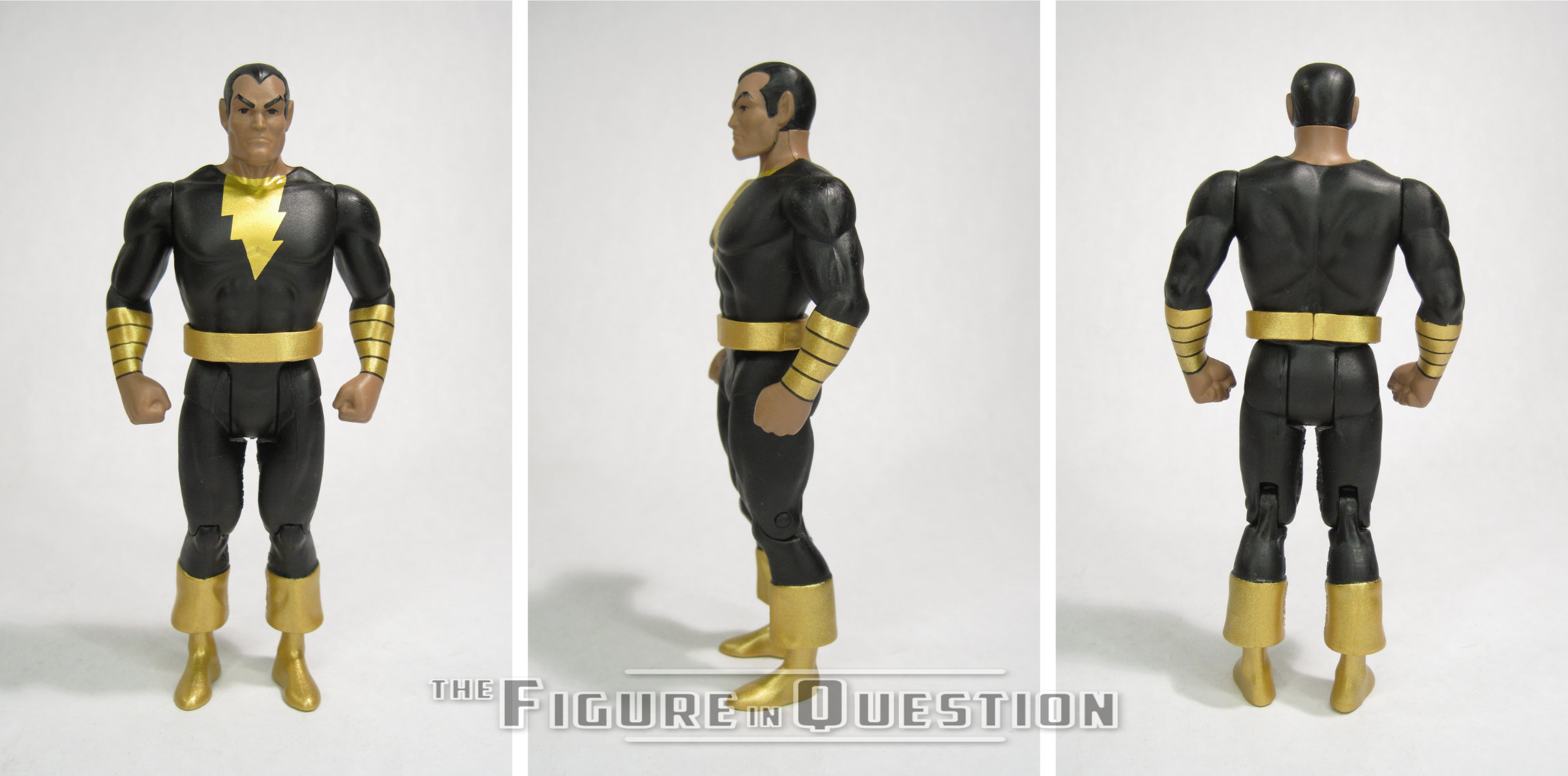
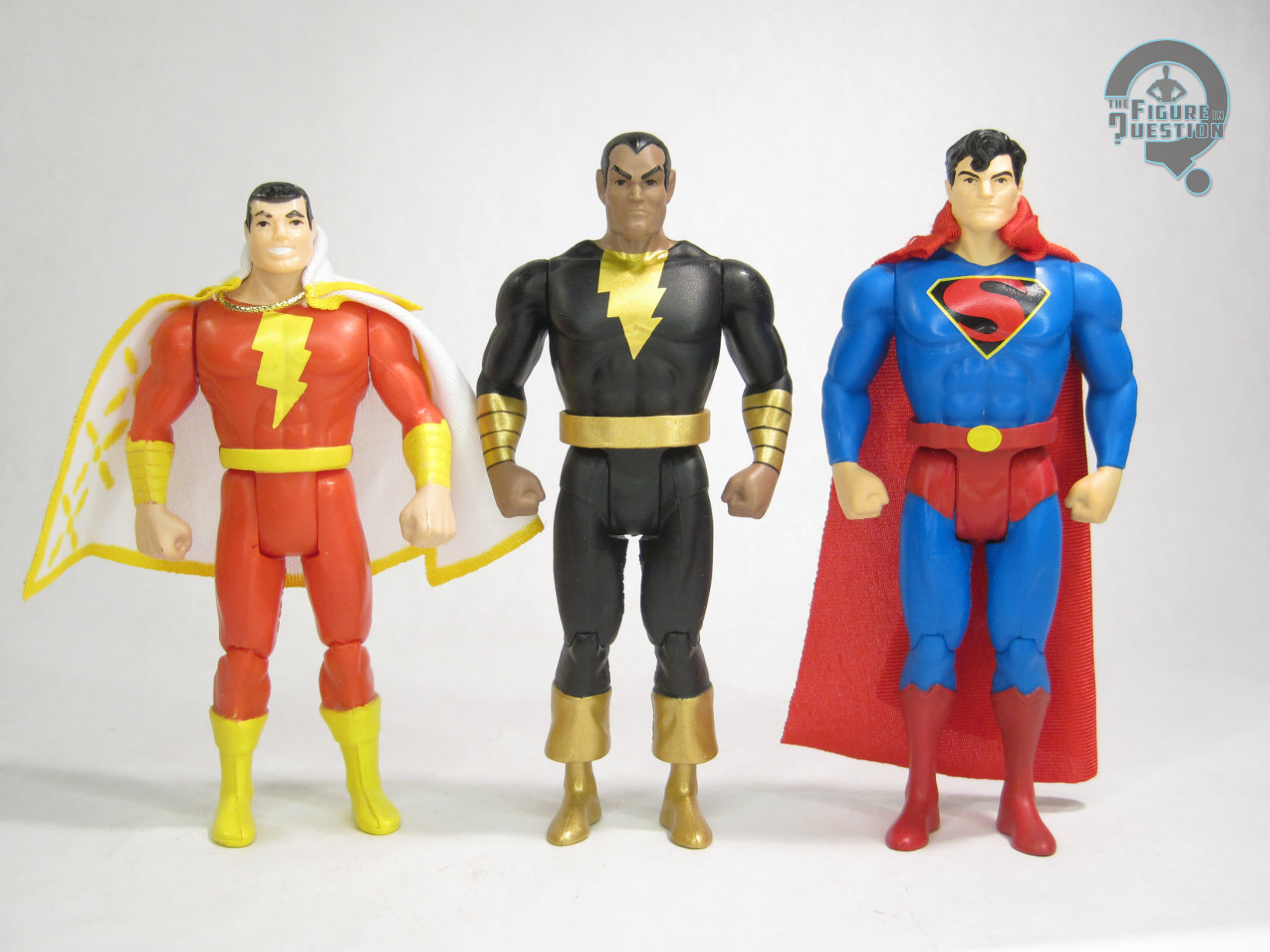
Robin is the final figure in Wave 13 of McFarlane’s Super Powers, numbered 66 in the overall line-up.  He’s not specifically denoted “Earth 2” anywhere on the packaging, but the bio on the back indicates it, though the call-out of Justice Society Infinity is a really specific post-Infinite Crisis reference.  When Earth 2 Dick Grayson first reappeared, he was sporting a costume heavily inspired by Batman’s, rather than his own Robin costume.  This figure is based instead on his second, more on brand costume, which, it should be noted, was actually worn by Earth 1 Dick Grayson first, during one of of the JLA/JSA crossovers.  Earth 2 Dick had full possession of it after that, though, and he kept the look until his demise during Crisis on Infinite Earths.  The figure stands 4 5/8 inches tall and he has 7 points of articulation.  He’s using the standard male body that’s based on the Flash mold, a first for any version of Dick in the line.  That said, it’s a far better match than the rather large base body of the first two Nightwings, and means he scales far better next to the various basic Batmen, so I certainly don’t mind it.  He gets a modified version of the Gold Label Nightwing head sculpt, with the hair removed on the sides and the lines of the mask removed, so that his wrap-around mask can be properly displayed.  I like that they keep that bit of consistency between the two.  He also gets a new belt piece, which matches well to his unique belt design as seen in the comics.  It’s all topped off with a cloth cape, which I think is actually a little nicer than a lot of the others from this line.  His color work is very bright and colorful, and the paint application is mostly pretty clean, and without any real slop or bleed over.

THE ME HALF OF THE EQUATION

When McFarlane’s Super Powers started, we got a modern Nightwing, and I figured that was the only Dick Grayson we’d get.  Then we got ‘90s Nightwing, and I was like, wow, I guess we’re getting two, but that’s got to be it, right.  Then we got ‘80s Nightwing, and I was really happy, but also 100% sure there was no way there could possibly be another Dick Grayson.  So this guy?  Totally out of left field.  Am I shocked?  A bit.  Am I unhappy?  Not in the slightest.  He turned out really well.  It’s a design that translates really well to the aesthetic, and it just makes for an incredibly fun figure.  And, sure, I’m now thinking it’d be great to *also* have his first costume, but you know what, I’m okay with just this one.

Bringing Back the Shameless Plug!

Hi there faithful readers! Do you love reading my reviews here on the site?  Well, I mean, I hope you do.  I hope you’re not all just hate reading. Whatever the case, while this site is primarily a labor of love, done for my own entertainment and amusement, it does carry with it some monetary costs.  In an effort to keep things running smoothly around here, I’ve officially launched the Figure in Question Patreon, and I’ll be adding a link to the sidebar as well.  If you like what I do and want to chip in, I have multiple tiers with some cool bonus benefits, so please feel free to check that out.  Otherwise, feel free to keep enjoying the site!  Now, back to the toy reviews!

#4124: Dr. Octopus

DR. OCTOPUS

SPIDER-MAN: THE ANIMATED SERIES (TOY BIZ)

“A laboratory explosion grafted four tentacle-like mechanical arms to the body of renowned Radiology expert Dr. Otto Octavius, warping his mind, transforming him into the genius know as Dr. Octopus! Octopus can control his titanium steel tentacles with but a thought – – and his thoughts are often of smashing his arch-foe, Spider-Man!”

The ‘90s was a pretty solid decade when it came to super hero cartoons.  At the head of the pack was Batman: The Animated Series, which everything else was kind of trying to imitate, at least in some fashion.  Perhaps the oddest case of this was Spider-Man: The Animated Series, which featured a surprising number of shared actors with BTAS.  Batman’s faithful butler Alfred’s voice actor Ephram Zimbalist Jr was one of the crossover actors, also lending his voice to Dr. Octopus, who was also one of the tie-in toyline’s first figures to roll out.  Let’s check him out today! 

THE FIGURE ITSELF

Dr. Octopus was released in the first series of Toy Biz’s Spider-Man: The Animated Series tie-in line.  As with the rest of the line’s early run figures, he’s based on his cartoon design (in contrast to a lot of the other Toy Biz 5-inch lines), itself based on Erik Larsen’s updated Doc Ock design from the comics around that time.  The figure stands just over 5 inches tall and he has 9 points of articulation.  He gets the standard set-up for the Toy Biz 5-inch figures in terms of movement, at least for the most part.  You can also get a little movement out of the tentacles, which can slightly turn at the base, but it’s sort of iffy and inconsistent.  The sculpt for this guy was all-new, though it would see re-use a few other times under Toy Biz, as well as serving as the inspiration for the smaller die cast figure and the 10-inch figure.  It’s based on his armored attire from the show, and it’s pretty good at that.  It’s certainly a more cut take on Otto than we usually see, but it was the ‘90s; everybody just looked like that.  I remember, I was there.  The hair’s not quite consistent with the show, which leaned into his Moe Howard cut; instead, it’s a little more contemporary.  All-in-all, not a bad sculpt, which captures the character pretty well.  The tentacles are a softer material, to allow for the action feature.  Pulling the (incredibly obvious and oddly shaped) tab on his back pulls the strings within the arms taut, so they sort of close inward.  It’s not a reliably good feature, but I guess it’s no worse for long-term livelihood than the usual bendy ones.  Doc Ock’s color work is pretty simple.  It matches the animation model, and its fairly clean on the application front.  It doesn’t do anything crazy, but it gets the job done.  Doc Ock included no accessories, rather common for the earlier figures in the line.

THE ME HALF OF THE EQUATION

I didn’t have this figure as a kid.  I remember him, and I remember others having him, but I never had one of my own.  Honestly, I never much clicked with Doc Ock until Spider-Man 2, and didn’t have much interest in figures of him until around that time.  This is a more recent addition, relatively speaking, although it’s probably been five years or so since I snagged this one loose from a collection that got traded into work.  He’s kind of a basic sort of figure, and doesn’t quite get into the sorts of things that later Doc Ocks got into, but he does manage to be a decent all-around figure. 

#4123: Boba Fett – The Pit of Carkoon

BOBA FETT — THE PIT OF CARKOON

STAR WARS SAGA (HASBRO)

“Part of the entourage accompanying Jabbe the Hutt to the Pit of Carkoon to watch the execution of Han Solo, the infamous bounty hunter Boba Fett leaps into battle to save his life after Jabba’s sail barge is attacked by Han’s rescuers.”

You gotta really respect the moxie of Star Wars Saga, the worst Star Wars toyline, for producing two figures of Boba Fett, one of the most popular “cool guys” in Star Wars, and having them both be based on objectively his lamest moments in the franchise.  His entry into the line was kid Boba, of the “hyuuup”-ing variety, and then the one Original Trilogy figure is specifically called out as being based on the moment just before his extremely humiliating death in Return of the Jedi.  Clearly, someone at Hasbro wasn’t feeling very generous to poor Boba.  Well, I’ll do my best not to humiliate him any further.

THE FIGURE ITSELF

Boba Fett — The Pit of Carkoon was figure number 08 in the 2003 assortment of Star Wars Saga, hitting in the line’s second year.  As touched on in the intro, he was the second Boba in the line, after the more direct Attack of the Clones tie-in figure from the launch assortment.  He was the first specifically Jedi-based Boba since the Power of the Force days.  The figure stands 3 3/4 inches tall and he has 12 points of articulation, plus a moving range-finder.  The movement on this guy is kind of interesting, because he’s more posable than was standard for the line at the time, but it’s all kind of weird.  Both legs get three joints each, but on the right leg, the two joints beneath the hip are on his knee, while the left leg puts both joints on the ankle.  His arms also both get swivels at the shoulders and the elbows, but the shoulders are tied into the action feature, so they can’t really hold a pose.  He himself is rather pre-posed, meant for a sort of firing his blaster from the hip while flying through the air pose, which…honestly, works pretty well.  Saga was frequently a mess with the over posing, but I gotta give them credit for the times they hit their mark.  The sculpt is honestly not bad.  It takes a lot of design cues from the 300th Boba, and that was a nice sculpt itself.  Hasbro rather liked this one, and wound up re-using it a lot until the more posable options came into vogue.  The only drawback of this release is the “missile” on his jetpack, which, due to doubling as the plunger used to activate his blaster firing action feature, is just the wrong shape.  The pilot Jango Fett from the prior year used the same feature, and had the same problem, but he had the other jetpack design, so it was less noticeable.  Boba’s color work is generally on the basic side.  He’s not too far off from what we were seeing with Power of the Force, which isn’t quite as technically impressive as later Fetts, but it’s also not a terrible look.  The basics are covered, and the sculpt is strong enough to shine through pretty well.  Boba was packed with his blaster rifle, a blast effect for the rifle, and a rocket blast flight stand that plugged into his jetpack.

THE ME HALF OF THE EQUATION

While not my first Boba Fett, this was the first one I actively chose to get.  Well, okay, it’s the first OT Boba I actively chose to get.  The second year of figures weren’t as plentiful as the first, but showed up in some weirder spots, notably the PX at the military base where my grandparents did their grocery shopping.  I was with my Grandmother for one of her trips, and got to pick out a few Star Wars figures, which wound up being this guy, Hoth Han, and robot hand Anakin.  Boba is the last hold-out of the trio, the one that stuck with my collection through a good number of purges.  I make fun of Saga and of Boba Fett, but I can’t knock this figure.  He’s kind of a gem of the line, much like last week’s Luke.

#4122: Moon Knight – Rivals

MOON KNIGHT — RIVALS

MARVEL LEGENDS (HASBRO)

“Bathed in a luminous aura that pierces the darkness, Moon Knight glides through the night, ready to sear his enemies with his master’s sacred Ankhs.”

Hey, we had an almost two year break between Moon Knight reviews there, but, have no fear, just two weeks later, I’m coming in with another Moon Knight review, because that’s just how I roll.  Also, you know, because I got two new Moon Knights relatively close to each other, and I’m passing that closeness onto you!  …Or something.  Today, though, it’s a little different, because it’s also a video game figure.  Hailing from the 2024 game, Marvel Rivals, it’s, umm, Marvel Rivals Moon Knight?  Yeah, that’s it.  That’s the ticket.

THE FIGURE ITSELF

Moon Knight is a standalone deluxe-sized release from Hasbro’s Marvel Rivals subset of Marvel Legends, shown and *sort of* released alongside the Rivals Punisher figure.  The figure stands 6 1/4 inches tall and he has 30 points of articulation.  Moon Knight sports an all-new sculpt, based on his standard skin from the game.  It’s a look clearly based on the Shalvey-designed armored up design, but filtered through the game’s edges upon edges sort of design aesthetic.  Aside from the faceplate feeling maybe just a touch too Taskmaster, it’s a fairly decent Moon Knight design.  The sculpt certainly does it justice.  The articulation is worked in pretty well, allowing for a good range of motion on most of the joints, while not breaking up the flow too much.  The shoulders are a little limited, and he’s stuck looking sort of downward a bit, but otherwise it works out okay.  While some of the game-based figures have brought the designs more into the general aesthetic of broader Legends set-up, the Rivals figures are more inline with the actual game looks, down to the slightly amplified proportions.  The details on the costume elements are quite sharp, and I quite like the texture work on the under suit in particular.  The standard cape has a sort of dramatic flow to it, mimicking his character screen from the game.  It looks pretty cool, and lends itself to a nice variety of poses.  The line work is sculpted, which helps give it some extra pop.  There’s a second cape included, set in an outstretched crescent shape like when he’s gliding.  Without some sort of flight stand, the posing options are slightly more limited, but it’s an impressive looking piece regardless.  The figure’s color work is actually quite involved.  There’s a number of different finishes to the white sections, which I quite like.  The darker sections are likewise varied, and all of the application is pretty cleanly handled.  Moon Knight is packed with a pair of crescent blades and a pair of Ankh batons, so he’s got some options for attack.  No way to store anything, and I was a little bummed by no extra hands, but the weapons do at least fit nicely into the gripping hands.

THE ME HALF OF THE EQUATION

Rivals isn’t available on any of the consoles I play the occasional video game on, so I’ve not had the opportunity to experience any of it first hand, but I know a fair bit of it through reputation.  My knowledge of Moon Knight’s inclusion is really that he’s in the game, and that’s it.  A new Moon Knight figure is a new Moon Knight figure, though, so I was onboard for this one from its announcement.  It’s a solid release.  Not my personal favorite of the many Moon Knights, but he does some cool, and more unique stuff, which I definitely appreciate.

Shoutout to my friends at All Time Toys, from whom I purchased this figure for review!  If you’re looking for cool toys both old and new, please check out their website and their eBay storefront.

#4121: Green Lantern – Hal Jordan

GREEN LANTERN — HAL JORDAN

SUPER POWERS (McFARLANE)

“Test pilot Hal Jordan went from being a novelty, the first-ever human Green Lantern, to one of the most legendary Lanterns to ever wield a power ring.”

We’re four episodes into Lanterns, the latest live-action adaptation of Green Lantern, and I gotta say, despite some definite reservations going in, I’m really quite enjoying it.  Though he’s not the real star (that’s John Stewart), my personal favorite GL Hal Jordan’s been getting some rather nice focus, courtesy of a very strong portrayal by Kyle Chandler, which is nicely adapting what works well about the character and stripping some of the stuff that…doesn’t.  I like the more seasoned take on Hal, a take that goes back to the character’s book’s relaunch in 1990, which positioned Hal as one of the last of the Silver Age heroes, and actually showing his age a bit.  And how did they show this? Well, the same way that you show that any male comics character is older and more distinguished: bright white streaks on his temples.  Yeah, that’s the ticket

THE FIGURE ITSELF

Green Lantern — Hal Jordan is the second to last figure in Wave 13 of McFarlane’s Super Powers continuation.  He’s figure 65, and is the first figure in this set not to be stealing someone else’s number.  Which is, admittedly, kind of amusing, because he’s astoundingly similar to another figure we’ve already gotten.  Hal’s obviously the post-1990 version of the character, meaning he ties in rather directly with the Cyborg Superman and Eradicator from this same set, as part of the “Reign of the Supermen” set-up, given his presence in that story and its effects on his own storyline.  His inclusion also feels like it’s probably meant to at least loosely tie into Lanterns, much like the Supergirl figure ties into her movie from this year.  Lastly, it serves to offer up an alternative figure for people who haven’t gotten the line’s first Hal GL, which was part of one of the change-over assortments after the line left Walmart, and which remains a rather pricey figure.  The figure stands 4 5/8 inches tall and he has 7 points of articulation.  He’s predominantly makes use of parts from the prior Hal figure, which makes a lot of sense.  That figure was, himself, mimicking the original Kenner mold, and doing a pretty good job of it, at that.  The Kenner mold’s one of my favorites, and I liked the update a lot too, so it’s a strong starting point.  Hal gets a brand-new head sculpt.  I was honestly surprised by that, since I feel like you could pretty easily just re-use the original head here, but they’ve decided to go for something more directly patterned on Pat Broderick’s depictions of Hal from the relaunch, specifically the shaping of the face, as well as the slightly longer hair.  I like that it still looks pretty consistently like the same guy, but he looks a little older than the last sculpt.  His paint work is *almost* identical to the last one.  The general layout and all the colors remain the same, but obviously he’s got the white streaks in his hair.  Also, his insignia is now outlined in black.  Don’t really know why, and it’s a departure from all the others, but it looks perfectly fine.  Hal is packed with his power battery, which is the same piece as last time.

THE ME HALF OF THE EQUATION

I was one of the lucky few to get ahold of the last Hal for a decent price, so I didn’t really *need* this one, but also I can’t say I hate that we got it.  He’s just got some minor changes, but they work well, and do help him feel more distinctly different from the main Hal.  The only real downside to this figure is that we get two Hals in the updated style, but never a John Stewart to match the rest of the GLs.  That said, this figure’s release does at least make a standard GL body more plentiful, should someone want to make a more classic John on their own…

#4120: Spider-Man – Web-Shooter

SPIDER-MAN — WEB-SHOOTER

SPIDER-MAN: THE ANIMATED SERIES (TOY BIZ)

“Not all of Spider-Man’s amazing powers came from the bite of a radioactive spider – some were created by Peter Parker himself. Case in point, his astonishing web shooters! Using his scientific know-how, Parker crated a device which, when filled with a secret formula of his own design, could duplicate the super-strong web of a spider!”

When Toy Biz started out with the Marvel license, they divided the characters into two sets, with one line dedicated to X-Men (which would also quickly spin-off into an X-Force dedicated line) and one covering…the rest.  Spider-Man was undoubtedly a major focus of Marvel Super Heroes, with multiple variants per series.  So, it wasn’t a shock that he was the first property outside of X-Men to get his own line, launched to coincide with his own animated series.  There were two Spidey variants in the line’s inaugural series, both dealing with his web-slinging powers, and today I’m taking a look at the Web-Shooter variant!

THE FIGURE ITSELF

Spider-Man — Web-Shooter was released in the first series of the Spider-Man: The Animated Series line in 1994.  In contrast to the X-Men line, which was (mostly) a comics based line that happened to coincide with the show, the Spider-Man was a specifically cartoon-based line, with all of the official branding from the show, and Spider-Man figures clearly patterned on his show design.  Web-Shooter was pretty much the closest the first series got to just a standard Spidey.  The figure stands 5 inches tall and he has 9 points of articulation.  Apart from lacking a right elbow joint due to the action feature, he’s got the basic set-up for the Toy Biz 5-inchers, plus a waist joint.  Not a bad set-up.  The figure’s sculpt is something I’ve actually sort of looked at before, because its two-up prototype served as the basis for the standard 10-inch Spidey.  It’s a good, solid, basic sculpt, which does most of what it needs to.  It’s perhaps a touch stiff for a Spidey, and the right arm is very limiting, especially given than the “web missile” is attached to a string and therefore cannot be removed.  There’s a reason so many of these show up loose with the string cut.  The color work on this figure is pretty standard for Spideys of the time, being an almost exact match for the Web Racer from the same series.  The early figures all utilized painted webs, and, honestly, I’ve come to prefer that over the years.  Otherwise, it’s bright and colorful, and just a good looking Spidey.  Since his “missile” was attached to him, Spidey’s only accessory was one of those plastic clips that mostly served as a way of padding the figures out for the appearance of value.

THE ME HALF OF THE EQUATION

I didn’t have either of the Series 1 Spider-Men as a kid, and both are much later, “hey it’s in front of me” sort of purchases, rather than actually actively wanting him…which is probably why this is one of those Toy Biz figures that I accidentally bought twice without even realizing it.  Whoops!  Well, I have him, and that’s the point.  He’s basic and a little limited by his action feature, but he’s certainly not bad.  Since we’d had so many Spider-Men from Toy Biz already at this point, experimenting a bit on these first two always felt like an okay choice.

Flashback Friday Figure Addendum #0090: Gambit & Psylocke

GAMBIT & PSYLOCKE

MARVEL MINIMATES (DIAMOND SELECT TOYS)

And here we are, with another Friday!  Alright.  Friday.  End of the week and all that.  So, let’s go for that flashing back thing, and jump back into the world of Minimates with a return look at Gambit and Psylocke!

When in doubt, I always turn to Minimates. I find the reviews to generally be a bit easier to write and I can be a little more enthusiastic about them, so they make for better writing in general (at least I sure hope so…). Today marks another Marvel Minimates review. This time around, I’m pulling from the great big world of X-Men with loveable rogue (who is coincidentally loved by Rogue) Gambit, and psychic fighter Psylocke!

THE FIGURES THMSELVES

Psylocke and Gambit were released in series 28 of Marvel Minimates. Originally, this was meant to be series 26 and it would have served as a loose tie-in to X-Men Origins: Wolverine, but it was pushed back to 28 when Diamond picked up the license to do Minimates directly from the movie.

PSYLOCKE

Psylocke is built on the basic Minimate body, which, means she stands about 2 ½ inches tall and she has 14 points of articulation. She’s based on Psylocke’s Jim Lee designed look from the early 90s, right around the time that she became Japanese (just go with it). She features two sculpted add-ons: a hair piece and a sash. The hair was originally sculpted for one of the BSG Starbucks, but it was actually released on Psylocke first. The sash may be a re-use, but I don’t know for sure. The paint work is pretty good overall, no slop or bleed over to speak of. One issue is the face seems a bit too narrow, like the paint mask wasn’t applied properly. Psylocke includes a katana, previously seen with Blade, and a “psy knife” which slips over her hand peg.

GAMBIT

Like Psylocke, Gambit is also built on the basic Minimate body. He’s based on Gambit’s default look through much of the 80s and 90s, which is the look most people associate with the character. The figure features a brand new trench coat piece, an all-new hair/headband piece, and a set of new boots. Lots of new stuff.  I do kind of wish that the bib wasn’t a part of the coat, but it looks pretty good. I do love how well they captured Gambit’s mop of unruly hair. The paint work is passable. There’s a bit of slop on the hands, and his face seems a tad too high on the head, but the torso detailing and the pink squares on the legs look great. Gambit included two spate hands with different charged cards and his fighting staff.

THE ME HALF OF THE EQUATION

This is another set of Minimates I picked up from Cosmic Comix when it was first released. I had eagerly been awaiting series 28, especially after taking part in and winning several prizes in a contest to guess this and series 25’s lineups. This isn’t my favorite version of Psylocke, but it’s not too bad, and Gambit is a character I’ve had an attachment to ever since the 90s animated series.

This was an early summer of 2014 review, which I wrote along with a much larger batch of reviews in the spring of 2014, while in Jess’s hometown for a week and some change-long visit.  There were a number of Minimate reviews written during that stretch in particular, for the reasons outlined in the intro.  A lot of Minimates in those early days.  This is a respectable review, I think, at least as far as the actual writing goes.  This review was one that went live with one of my original “index” photos, which were a lot more basic and not so artsy.  Also, they were missing a bunch of the parts, so, hey, here’s all that stuff now!  Pretty neat!